| PROJECT | Website Relaunch Raiffeisen.ch |
| STATUS | Ongoing |
| ROLE | Consultant and Concept Lead |
| TASKS | Concept, Research, Documentation, Prototyping, Usability Testing, UI Design, Requirements Definition, Enabling |
Summary
As a Concept Lead, I support the Raiffeisen project team responsible for the website relaunch of raiffeisen.ch – an important digital touchpoint for over 2 million Raiffeisen customers. This complex, multi-year project is segmented into various work packages, aligning with the bank’s unique organizational structure.
Goals
- Rethink and redesign the bank’s website to make it more user-friendly, accessible, and informative for all users, regardless of their financial literacy or experience.
- Align the design work to the various other Raiffeisen experiences ensuring a seamless user experience across all touchpoints
- Apply Raiffeisens’ overall design principles: Simple, Close and Clear (“Einfach, Nah und Klar”)
Challenges
- User needs span a broad spectrum, encompassing both financial experts and novices
- The website contains an overwhelming amount of information
- The primary navigation lacks effectiveness
- Cater to the business requirements of over 200 Raiffeisen Banks and other stakeholders within the Raiffeisen Group
- Enable hundreds of Marketing Professionals in adapting to the new website concept
- Create seamless user journeys across multiple Raiffeisen touchpoints (incl. alignment of UI and interaction design patterns)
Approach
The extensive project has been divided into multiple work packages, aligning with distinct website sections such as Investing, Payment, About Us, etc.
Using qualitative methods such as Journey Interviews and Card Sortings (moderated), I gathered valuable insights about the users› pain points, jobs, and needs. I learned about their mental models, which helped me shape the new website structure (information architecture).
At various stages of the design process, I tested ideas through usability testing. This helped me iteratively refine the concepts and the new designs.
Working closely with the Scrum Team, I aligned user feedback with business goals, prioritized efforts, refined the product backlog, defined product increments, and derived design requirements.
I collaborated closely with marketers and UX writers to develop content concepts for various pages and website sections.
To ensure effective communication of the website relaunch process to over 220 Raiffeisen banks, I crafted a comprehensive training concept. This empowers the marketing managers of Raiffeisen banks to seamlessly implement the new website concept.
Iteration
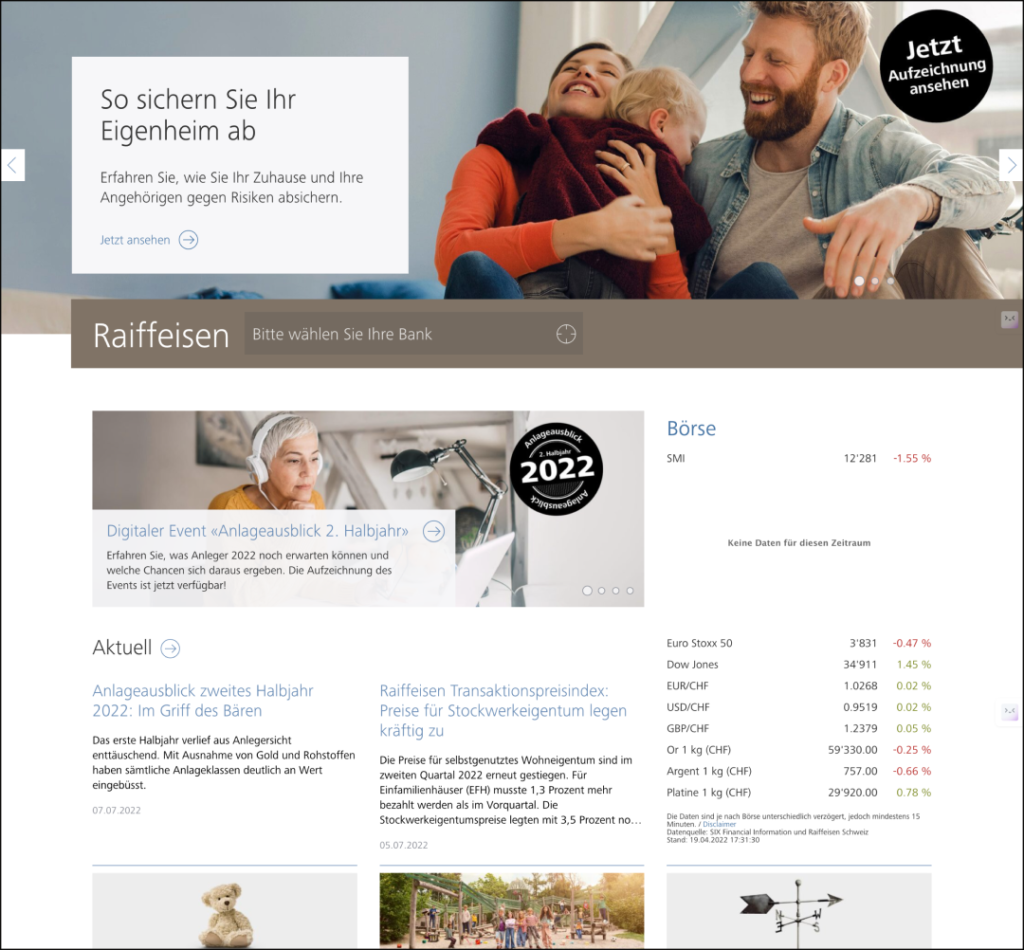
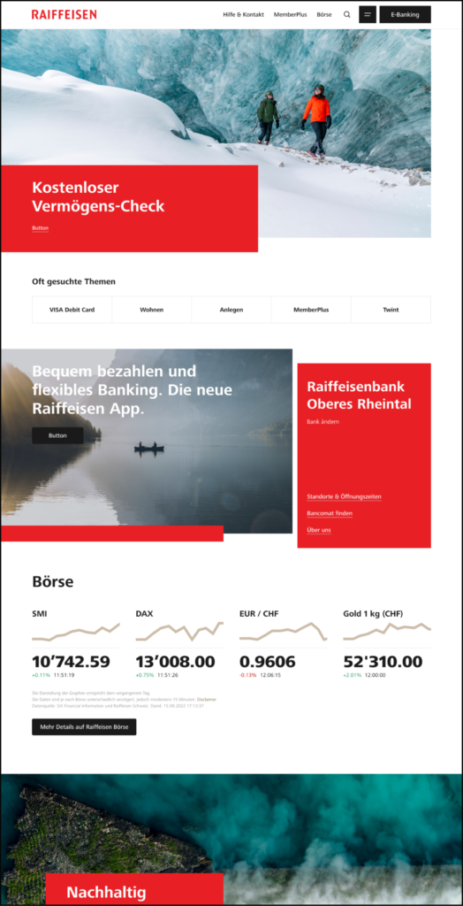
After the relaunch, initial feedback indicated dissatisfaction among both users and business stakeholders regarding the positioning of the local Raiffeisenbank below the viewport (see Figure 3).
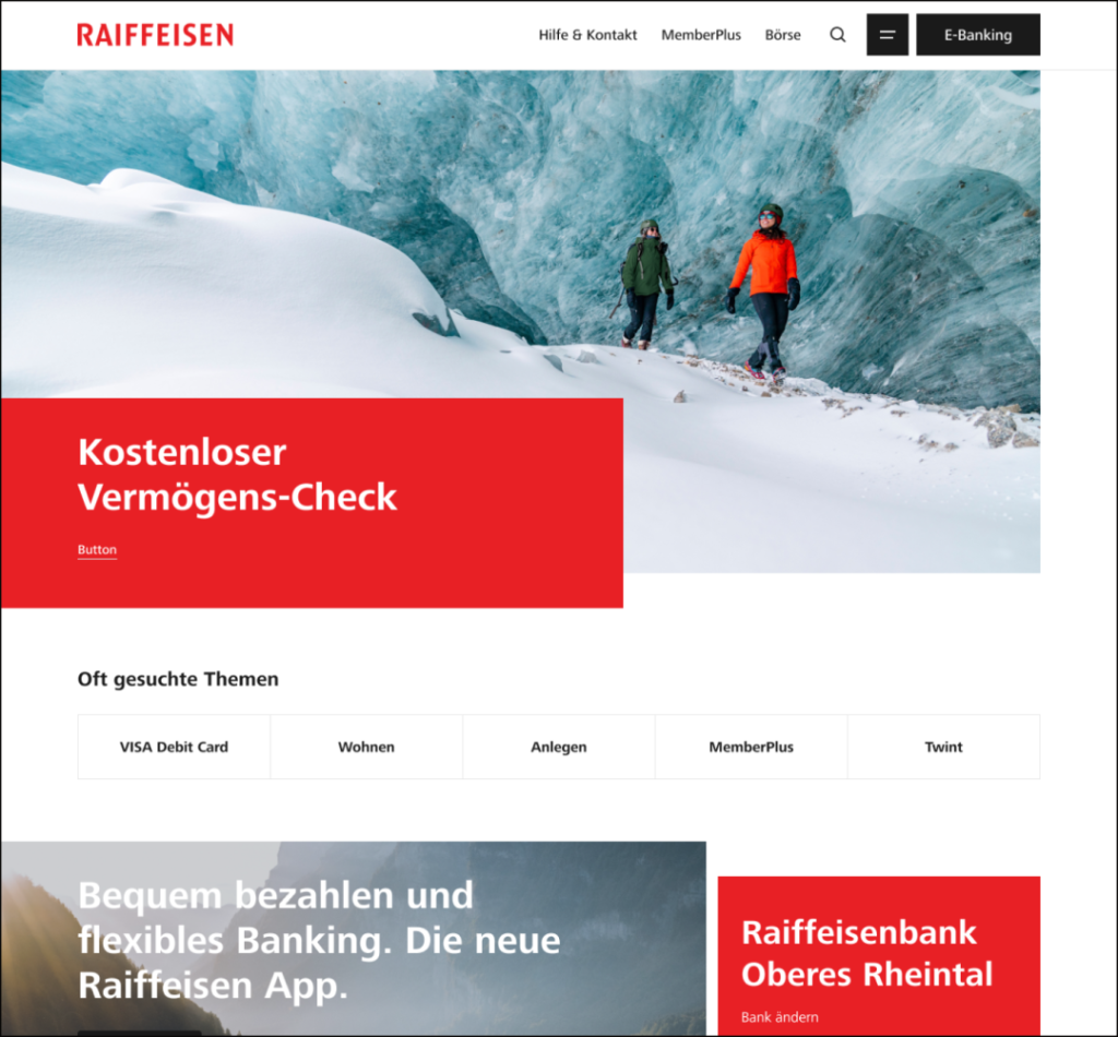
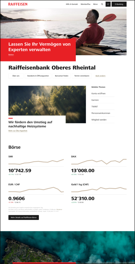
By prioritizing this issue and adjusting the roadmap, an enhanced version addressing the pain point has been iteratively developed (see Figure 4).
Results
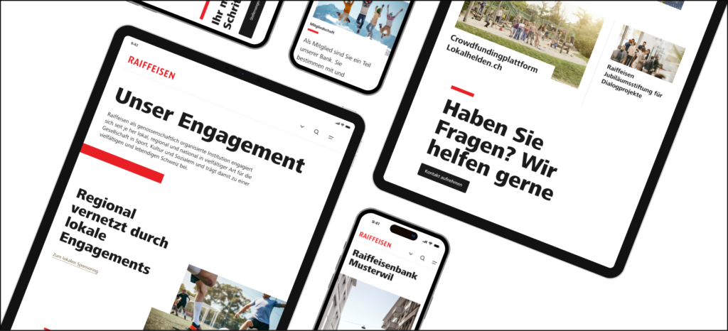
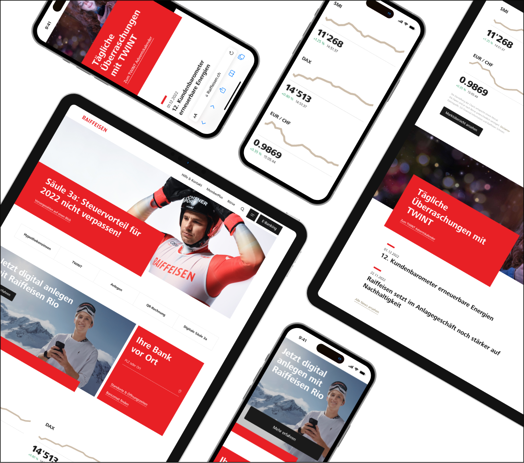
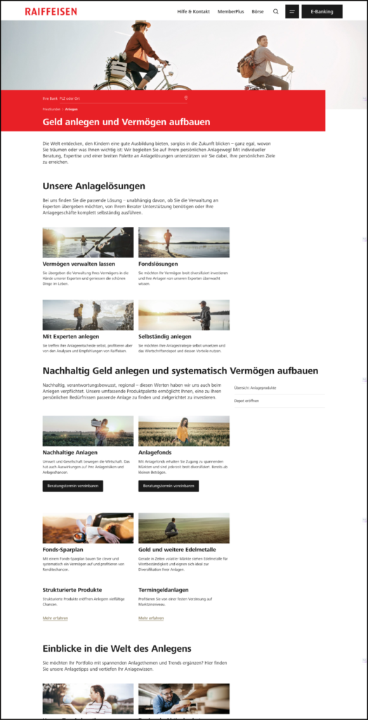
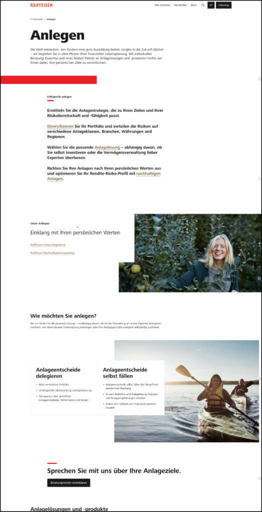
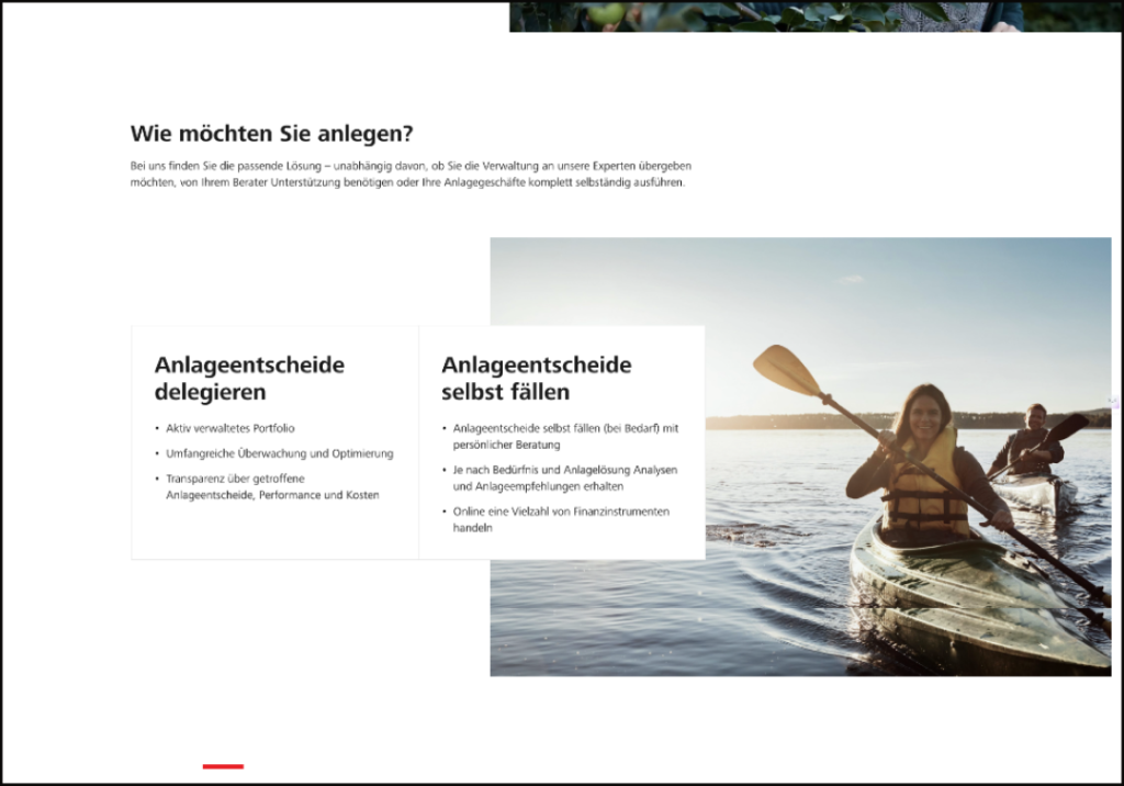
The new website concept is already visible in the sections ‹Home›, ‹Account and Payment›, ‹Housing & Mortgages›, ‹Investing› (see Figures 5 and 6), and ‹Precaution and Insurance›. The ‹About Us› section, heavily involving all banks, will be implemented in the course of 2024 (see Figure 7).
Initial customer feedback indicates a highly positive reception, affirming that the new design effectively meets customer needs. Moreover, website editors report a notably optimized workflow in Adobe Experience Manager, enhancing overall efficiency.
Furthermore, insights indicate a notable increase in click-through rates on personalized teasers. Consequently, the team has prioritized enabling personalized teasers on the entire homepage, anticipating sustained improvements in CTR in the coming months.
However, the two topics currently in use remain quite broad. Further research is planned to delve deeper into the mental models of users and enhance this section accordingly.